1. Originally posted by AMLBONO:[..]
    Same here. Live in Canada and we are starting to reopen but I have not watched any American news and have 'unfriended' family who live in America who support Trump. I'm disgusted at how politicalized it has become. It's a disease. It doesn't matter if you are a Republican or a Democrat. If you wear a mask you are not a p$%&y. If you wear a mask you are not a radical left wingest. You are protecting yourself and the health of others.

    Daughter's birthday today and we had a small 'social distanced' birthday party for her. Under 10 people and everyone separated by 6 feet.

    Is there going to be an end?
    Your country is sounding pretty damned good to me lately, I can’t lie. Coronavirus is a world problem, not an American problem... but the America media has morphed this already stressful and awful pandemic into something even worse. It’s going to be absolutely unbearable to live in the US for the next 4 months, until the election. Throw coronavirus and senseless racial tension on top of politics... fuck this ride, I want off!!

    I’m no so much concerned anymore about what I can and can’t do. I’m a simple man, give me a small group of friends having a cookout in somebody’s back yard, and that’s all the socializing I need. I don’t really miss bars and restaurants. I can live without a lot of things. It’s more just the fact that we’re all in this constant state of worry that’s really starting to get to me. People are dying every single day from this, in large numbers. And what’s the future look like? Nobody knows. Nobody has any fucking good news. There is no positive outlook on the horizon. All we have is a vague promise of a vaccine sometime in 2021, and that is literally the only hopeful notion out there right now.

    I find myself longing for simpler times, like even last fucking year!!! I remember being stressed out about things last summer that don’t mean shit to me anymore. I’d give anything to have slight money trouble or U2 setlists to be my biggest concern again. Don’t mean to bug ya... just kind of passed into a new stage today, mentally. 2020 sucks!
  2. Lucky Australia is an isolated island from the world and one big country. We went into lockdown a bit late but isolated and recovered well, that all states have reopened basically everything. Some without restrictions, some with number limitation and social spacing. Current numbers as of 25/6 are; 7,521 confirmed cases, 6,924 recovered, 103 deaths from the virus. Some states have even allow crowds back into sports stadiums such as the NRL and AFL. Some states do have border control and mandatory 14 day isolation for those who enter their state.

    While this is all good news, we have seen a small outbreak of civid19 in Victoria, Melbourne. Not alarming as of yet. Between 20-30 a day, but enough to put the brakes on easing restrictions at the moment and see what happens with these small clusters. Some states have locked out anyone from Victoria entering other states. Just shows how Australia’s governments don’t take any chances on the small outbreaks to get worse. Hopefully not enough for the state of Victoria to go into tighter restrictions again.
  3. Some potential glimmers of hope from the UK in the last 24 hours with human vaccine trials now underway on 300 people (iirc) that have already been successful in animals. By no means a guarantee that this will translate to humans - but you never know.

    Plus this new steroid drug that can help treat infected patients and reduce deaths by a third I think it was announced last week. And there will likely be other treatments that come to light to further mitigate the effect of CV.

    Meanwhile let's just hope the masses play it as safe as is reasonably possible. So many stupid people who bypassed the commonsense department as they came into the world, as well as sheer nasty people like all these that have been spitting on supermarket food or attacking paramedics etc. The mind boggles. It does make you wonder where things are gonna end up with how some people behave, but yeah some small glimmers of hope recently.
  4. Why do I get the feeling that other countries will develop treatments, but the US is going to wait until Big Pharma rolls out their big vaccine. I’m not even a conspiracy theorist, but I do know that in America, money is always the first priority, even in our government, and often at the expense of people’s health and safety.
  5. Originally posted by podiumboy:Why do I get the feeling that other countries will develop treatments, but the US is going to wait until Big Pharma rolls out their big vaccine. I’m not even a conspiracy theorist, but I do know that in America, money is always the first priority, even in our government, and often at the expense of people’s health and safety.
    That's totally what's going to happen. With millions and millions uninsured, it'll be a disaster.
  6. Everything counts...
  7. But making it free is far too socialist and people should just not get sick 🙄
  8. That notwithstanding, in the UK we've got human trials now, but I'm not actually sure how much we're expecting from this trial - it's still a big step forward.... but the government just voted against testing every week for nurses, there was an emergency declared on the beaches yesterday cos 1000s of people went and then 2000 people went to Anfield to celebrate Liverpool winning the league (to make them level with Blackburn and Leicester on 1 PL title - deluded fans )
  9. Originally posted by WideAwakeBadBoy:That notwithstanding, in the UK we've got human trials now, but I'm not actually sure how much we're expecting from this trial - it's still a big step forward.... but the government just voted against testing every week for nurses, there was an emergency declared on the beaches yesterday cos 1000s of people went and then 2000 people went to Anfield to celebrate Liverpool winning the league (to make them level with Blackburn and Leicester on 1 PL title - deluded fans )
    Those scenes were utter madness - the beach especially, and I'm happy for Liverpool but disappointed so many gathered outside Anfield - stupidity.

    So many people really not getting this. It's one thing to disregard your own personal safety, but this is about everyone's personal safety and not proliferating it further not just to the elderly and vulnerable, but to literally everyone - the disease is indiscriminate on who it effects and how badly it effects them.

    Most of those people yesterday either don't give a flying monkeys, think they're immune as they're young and/or healthy or even worse think it's a 'common flu' or worse still don't even believe this thing is real. That's one thing to risk your own health and life, but this is about everyone's safety. So many selfish people on this planet and this pandemic is really highlighting it.

    All that said though, as was pointed out to me yesterday, thankfully whilst there was a lot of people at both those scenes yesterday, which will undoubtedly push the R rate up and potentially cause a new upwards trend of cases in the coming weeks, the vast majority of us are actually taking this with at least some seriousness.
  10. The R rate has always been of interest and concern to me. I share here my paper written in the early weeks of the outbreak.


    Coronavirus: a narrative through data analysis

    The reason for talking data?

    I have been asked by a number of peers for my take on the Coronavirus pandemic, on the basis I am an academic researcher as a profession, which seemed like a fair request. I do have a take on it, but I’m often reluctant to comment on things I’m not well versed in – after all I am not a medical doctor or an epidemiologist and probably know as much as the next person who reads the news. What I am well versed in is data analysis and it’s the uses and misuses of data in the coverage of this crisis that have fascinated me the most. After all, who can remember a global issue where the data is so central to the public’s understanding? So with the help of accompanying charts and some simple concepts, I will try to explain why I find the data story of COVID-19 such an interesting one.

    Infections can’t easily be counted

    Unlike SARS, Ebola or Measles which have more obvious signals, one of the main issues with this particular pandemic is the fact its victims can be asymptomatic or mildly symptomatic. This makes accurate estimates of the number of cases very difficult. UK Public Health authorities acknowledge their figures are likely to be underestimates, but do not give any indication by how much (and how could they know?). Respectable researchers across the globe have used modelling to speculate on the margin of error in case estimates and come up with very different conclusions, all of which are debated and deconstructed by other researchers.

    At one extreme a study by Oxford University’s Centre for Infectious Diseases concluded that as much as half of the UK population could already have been infected; if this were true it would have profound public health and policy implications. At the other extreme, the current caseload figures from the Department of Health, based on hospital admissions, would indicate that as little as 0.04 per cent of the population have been infected. This is several orders of magnitude adrift, but is probably the most transparent means of reporting available right now.

    Testing regimes are an important piece of the puzzle as far as case estimates go and, I suspect, the margin of error is proportionate to the number of tests carried out (that is the more tests carried out, the greater the confidence in the estimates). The data on testing, from what I have read, is riddled with flaws and inconsistencies, which is a whole other subject beyond my realm of comprehension (definition of ‘test’, time periods, confirmed, pending and so on).

    But there are clear signals in the data. Countries like South Korea and Germany, which are regarded as ‘doing well’ share a common characteristic, namely the number of tests carried out per million population are relatively high compared to, say, the USA and UK, who are still catching up. This means they have a stronger basis for estimating the prevalence of the disease nationwide and can track its spread and concentration, making their management of it more effective. Remember, I am not an epidemiologist, so it’s quite possible I’ve over-simplified this.

    In the immediate term, the number of people becoming very sick form COVID-19 and ending up in hospital is, in a way, all we need to understand. But in the longer term, when the UK’s strategy moves from ‘flattening the curve’ to track and trace, as it has done in China, Singapore, Hong Kong and others, the ability to quantify the prevalence and spread of the disease will be a major constraint on any strategy for containing it and preventing future outbreaks. This is why I find the sub-plot of data quality and volume of data so compelling.

    What does ‘exponential growth’ really mean?

    It is important to grasp what exponential means before discussing the data around fatalities, which is key to understanding the data story. Pandemics spread in exponential fashion, which means they have the potential to progress from single figures to scarily large numbers in a short time. So, if 1 person contracts COVID-19 and infects 3 people and they in turn infect 3 other people and this pattern continues, by day 13 we have a million people infected. OK, this is an ‘all things being equal’ growth rate, with no break in the infection chain, which is unrealistic. But diseases tend to follow a fairly predictable exponential growth rate in their early stages, which is what gives us the now-familiar peak which every nation is working hard to squash and flatten.

    Italy is one country which has exhibited this exponential pattern and although its plight is an awful one and not to be downplayed, its experience may not be as unique as the coverage seems. It is entirely plausible that the UK’s fatalities could exceed Italy’s current total as early as next week, based on its trajectory (the effects lockdown may change this). When COVID-19 broke out in the UK the death toll did not seem to increase quickly, going up from one to 10 in around one week. But after two weeks, that total had increased to 144. The period between March 14 and March 19 saw an increase of 123, or put another way a 6-fold increase. In the week-long period following, a three-fold increase occurred (177 to 759 deaths) and an 8-fold increase from 27 March to April 8 (Fig. 1). This is what exponential means in real terms and what gives the curve that characteristic steepness.


    Cumulative COVID-19 deaths in the UK to April 8

    Although each death is a personal tragedy for the victims and families involved, the absolute numbers matter less for the point I am making. It is the growth rate that’s the real story. And in the UK that rate has been high from the very beginning – comparable with Italy, Spain, China and other epicentres of the pandemic. A week or so after the first death in the UK, the number of deaths was roughly doubling every two days and for the past week or so, it has been roughly doubling every
    three days. To give those numbers some context, were that trend to continue unabated, the UK would have recorded around 10,000 deaths in a few days’ time and the direction of travel would be every bit as troubling as Italy’s.

    On this chart of worldwide deaths (Fig. 2), the points at which deaths were doubled are marked and it’s clear that the early stages of the pandemic show the fastest growth rate in deaths. Although the numbers increase steeply, we also see that the rate of doubling becomes more spaced out through the steepest portion of the curve, which underlines the point that the rates matter more than the numbers (statistically, not morally, of course).


    COVID-19 deaths worldwide with doubling indicated

    The media talks about the UK being two-to-three weeks behind Italy’s epidemic. To compare the two we need to account for this time difference and plot how deaths have increased over time since the first death was reported. The following chart (Fig.3) plots deaths in both countries for day of first death, showing close alignment in the trends, but higher absolute numbers in Italy throughout (for which there are a multitude of reasons being posited, from demographic make-up to genetic predisposition to complacency to lack of warning).


    COVID-19 deaths in UK and Italy from day of first death

    These patterns of growth, combined with finite capacities in healthcare systems is why COVID-19 has proven so devastating. We have observed how intensive care capacity does not seem to be proportionate to population sizes, which explains why governments worldwide are pursuing social distancing to slow the transmission of the disease and suppress the growth rate in deaths.
    The exponential is, I hope, explained – a cruel but clear natural logic.

    Enter the logarithm

    I have noticed the media and governments are quite savvy about the way data are presented, depending on the argument they are trying to make. When reinforcing the ‘stay at home, stay safe, protect the NHS’ message, the exponential is the star of the show – dramatic, steep, frankly terrifying. When trying to reassure that the curve can be flattened, another form of presentation is used – the logarithmic scale.

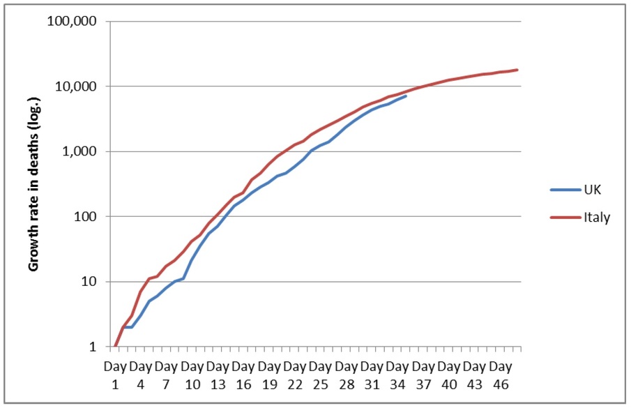
    The term is off-putting, but the concept is simple. Think of it as a way of representing the growth rate, rather than the actual numbers. In the chart below (Fig. 4), the same data on deaths in the UK and Italy are presented on a logarithmic scale.


    COVID-19 death rates in UK and Italy plotted logarithmically (Fig 4)

    The notable feature here is the relative flatness and shallow gradient of the line, compared to the exponential. You can also see, in the UK particularly, the times in which the growth rate in deaths speeds up and slows down. Granted it’s fairly subtle, but Italy’s death rate is actually beginning to flatten off in response to the measures put in place, which is what public health experts also expect to see in the UK. I am not a big fan of logarithmic scales for other purposes, but for pandemics they work particularly well and provide a more balanced picture of how the disease is progressing and spreading.

    The logarithmic scale gives us a level playing field when comparing the disease’s progression in different parts of the world that are all at different stages of the outbreak. The chart below plots several countries with significant outbreaks logarithmically to demonstrate the point.

    COVID-19 death rates across countries on a logarithmic scale (Fig 5)


    The tendency in the media has been to treat Italy as an outlier, or a benchmark against which other outbreaks should be compared. But, the chart reveals why, in statistical terms, this does not make sense (again I don’t mean to diminish the humanitarian cost or disrespect those who have lost their lives). It is the steepness and shape of the curve that matters here and for the most part they are roughly the same, except first deaths occurred on different dates.

    To take this a stage further, let’s look at what happens if you were (hypothetically) to start each country’s epidemic on the same date, cancelling out the time differences we see in the above chart. The chart below illustrates this scenario and what we see is remarkable similarity in the trends (with the exception of China). What jumps out is the severity of the situation in Spain, which despite being talked about less sensationally than Italy in the media, has a faster growth rate in deaths. Were this to continue, Spain’s death toll would outstrip Italy’s by a margin.

    Despite the perception of Germany having a less severe epidemic, which it does in terms of outright numbers, the growth rate in deaths is very similar to that in the UK, which is counterintuitive. The USA is interesting for different reasons – what appears to be an accelerating growth rate in deaths showing no sign of flattening out yet. The trend in recent days there has been very steep and USA’s trend line has now crossed Italy’s, meaning the USA’s death rate is in excess of Italy’s from that point onward.

    COVID-19 death rates across countries from equalised start dates (Fig 6)


    So the point is….

    Ways of presenting data matter greatly to the public’s perception and understanding, particularly during a pandemic, where that understanding can only really be formed in numbers. If you have read this far, then hopefully you’ll now have some tools to help you look out for these differences in how things are presented, depending on the message the deliverer wants to get across – setting out not to deceive, but to emphasise and reinforce, which is important when requiring people to behave and think very differently.

    The data story has many sub-plots and there are other things I would love to get into here. I have read articles on the effects of population density, testing regimes, rural vs urban behaviours and even political affiliation. All these things, it seems, can affect the spread and impact of a virus.

    My own take on all of this and my curiosity around the data goes deeper; I wonder about the different standards of recording, data definitions, lag-times, modelling assumptions and much more. But maybe for another day.

    Dr. Julian Lewis (PhD)

  11. ---