1. Notice how the songtitels on the inner sleeves are in four different handwritings…..
  2. What is the running time?
  3. Edge mentioned that once they had four distinct albums it was easy to see who would be the figurehead for each one. I hope they expand on this... interesting stuff
  4. I'm equally baffled by the album artwork but think it's a little repetitive. They used the same four image approach on Pop but also on the single for Unforgettable Fire. Surely they could have come up with something more original.
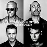
  5. This could have been the SoS artwork…
  6. ⬆️ brilliant
  7. I would actually have them facing away from each other.
  8. Looks like a staring contest, but I think it gels more than the current cover LOL..

    Edit: actually, we need a pic of Adam's current look on the cover