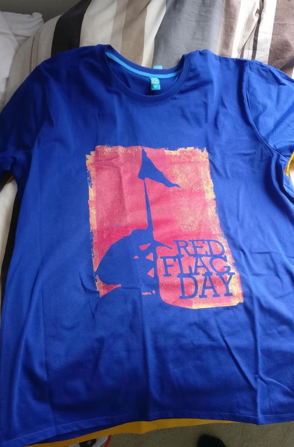
This just came.
The letters in the left one are a little faded away. Otherwise, great quality
EDIT: the design had those letters faded from the beginning. I just checked the store.
These are great shirts!
Originally posted by DerBFreund:[image]
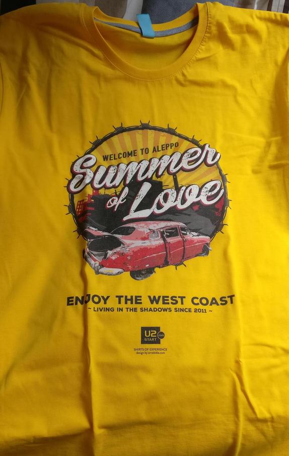
This just came.
The letters in the left one are a little faded away. Otherwise, great quality
EDIT: the design had those letters faded from the beginning. I just checked the store.
These are great shirts!
Originally posted by LikeASong:[.It that Blackout font an actual font you can download somewhere , mister designer?.]
Helvetica 65 Medium (Bold).
Originally posted by MagiX:[..]
Sorry, but that's wrong.
The Font on the BLACKOUT-Cover is "Brandon Grotesque"
Originally posted by BigGiRL:[..]
The Helevtica font is the font that I used for the first "Blackout" shirt. The one with 4 times the word "Blackout".
Sergio actually refered to that first shirt.

Originally posted by DerBFreund:[image]
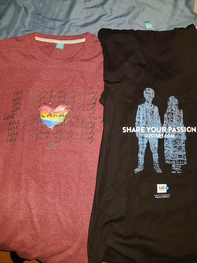
This just came.
The letters in the left one are a little faded away. Otherwise, great quality
EDIT: the design had those letters faded from the beginning. I just checked the store.
These are great shirts!
 Sorry. It looks neat anyway, I think! And what to say about the "corporate" one...

Originally posted by DerBFreund:Haha I knew the lettering wouldn't look that great before I bought it, but the heart looks amazing with the reddish background .
Glad you like it anyway. When can we see a photo of you wearing it? 
Originally posted by DerBFreund:Bono's definitely lol
A pic? I guess I'll save it for my New York shows